
Design seems like such a simple, elementary thing when you think about it, but hordes of people keep getting the basics wrong, often with hilarious and side-splitting results. Buildings are hard to design, as are other objects, but we usually take the layout of sentences and phrases for granted, as though everyone will be able to understand us no matter how.we.words.our.place.
How Do I Apply?
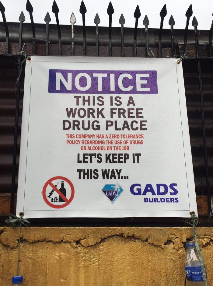
Noted
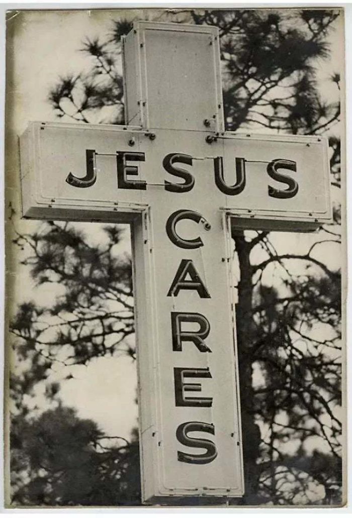
Apparently Scary Jesus Is A Thing
One of the online communities where similar text design fails are shared daily is the subreddit ‘Don’t Dead Open Inside,’ which prides itself on collecting the most egregious examples of signs and media that don’t make any sense if you read them normally. The community, which was established in May 2014, is large, having grown to over 513,000 members.
According to one moderator, people make mistakes while designing text because “they’re either not thinking or they want to be original. Our main mission statement is to show them that they are wrong.”
They also had advice for those individuals willing to step up their game design-wise: “People in the west read left to right, then top to bottom. Do not “liven up” your text by making it “quirky”. Hard to read means lost attention which translates to lost revenue.”
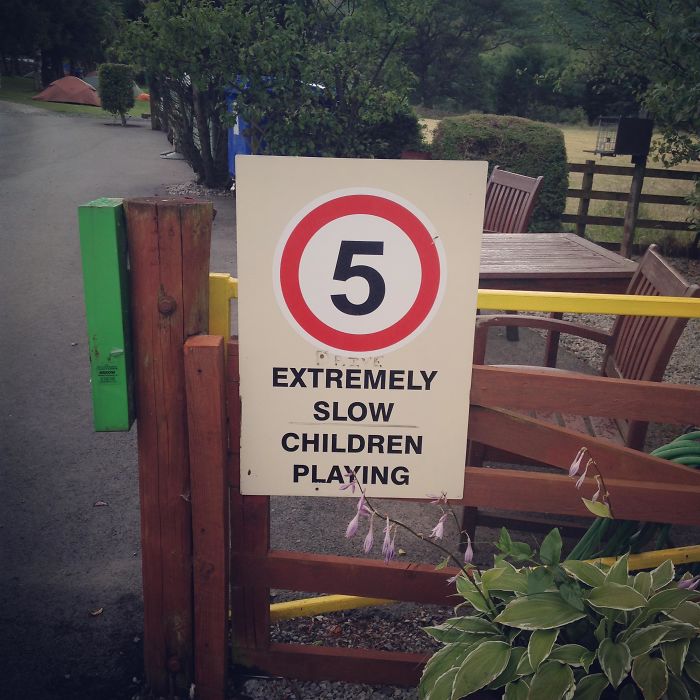
Five Extremely Slow Children Playing
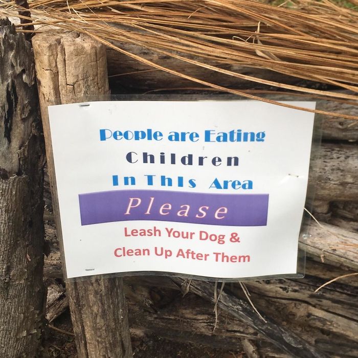
This Terribly Worded Sign I Saw Today. Sorry, I’ll Pick Up My Dog’s Poop… Wouldn’t Want To Ruin Your Child Eating Experience
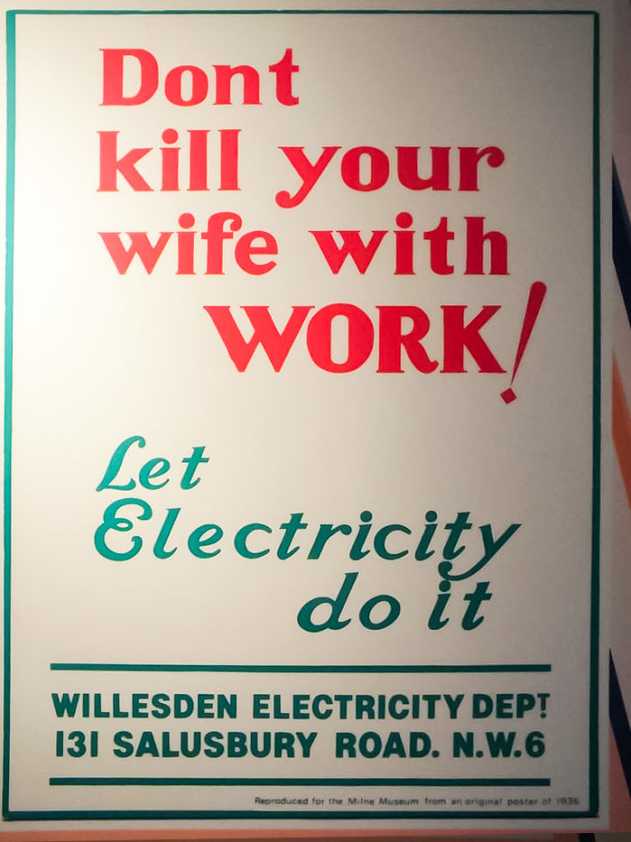
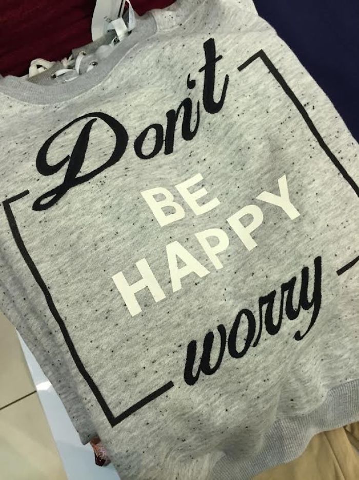
Well, Uh… I Guess That’s A Good Motto
Canva has some handy tips for those of you willing to up your design game when it comes to words. For example, Canva suggests that you limit the number of fonts that you use and use simple ones, rather than complex ones that might not mesh together well.
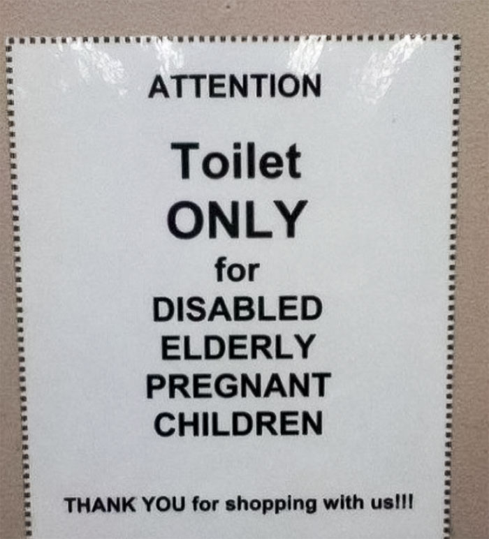
Attention
Thanks For The Advice
Experience

Spacing, something most of us rarely think about, is also important and can bring about radically different effects simply by eliminating the negative space between letters, words, and sentences.
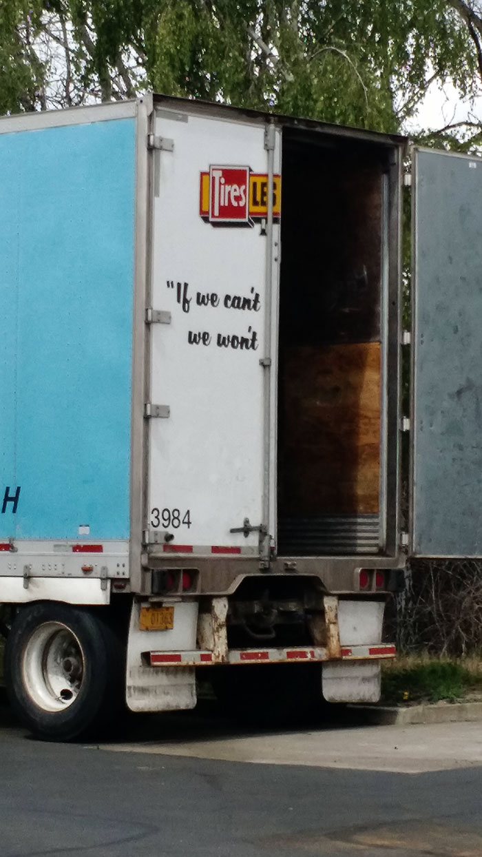
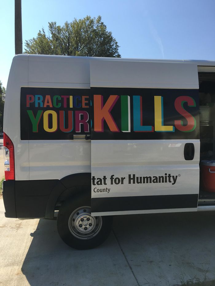
This Habitat For Humanity Van
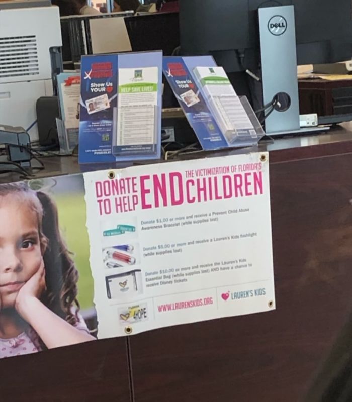
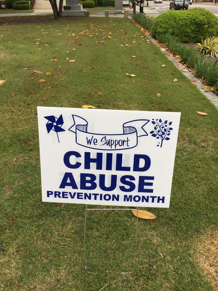
Who Else Is Donating To End Children?
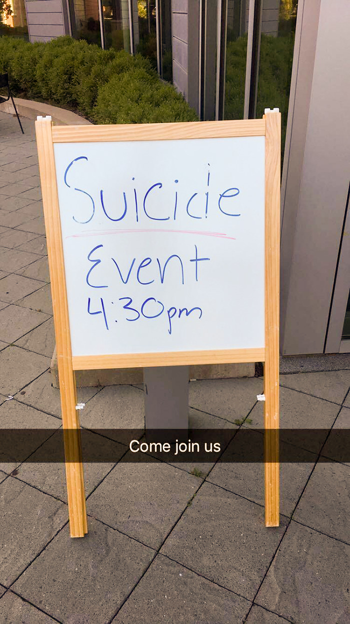
So My Campus Had A Suicide Awareness And Prevention Day
Meanwhile, colors are equally important: use them to your advantage to create harmony between different parts of the text. Use contrasting and complementary colors. Lines can be used to guide the reader’s attention and create symmetry; however, badly used lines can turn a sign or a design into a catastrophe. Think you’ve got all that? Good. Let us know how you’d fix the text designs in this list.
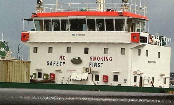
No Safety. Smoking First
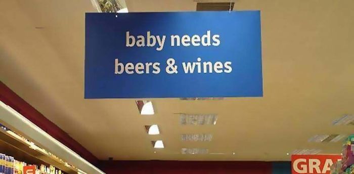
Baby Needs Beers & Wines
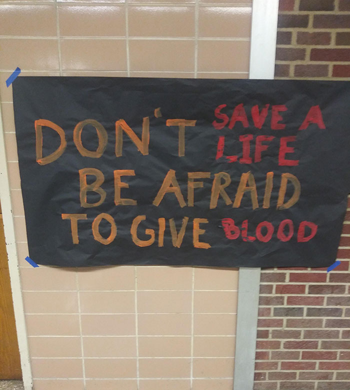
Don’t Save A Life. Be Afraid To Give Blood
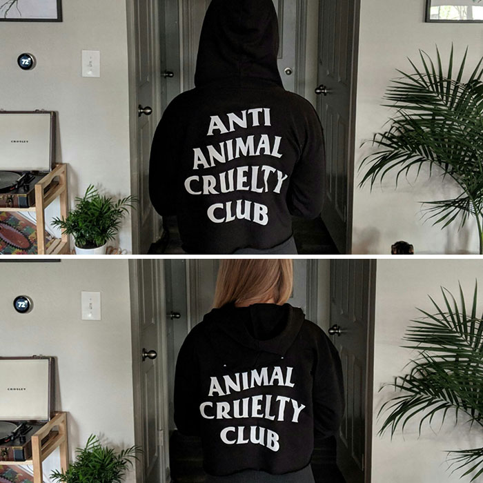
Hood On vs. Hood Off
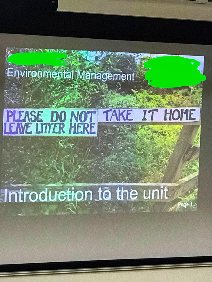
Please Do Not Take It Home. Leave Litter Here
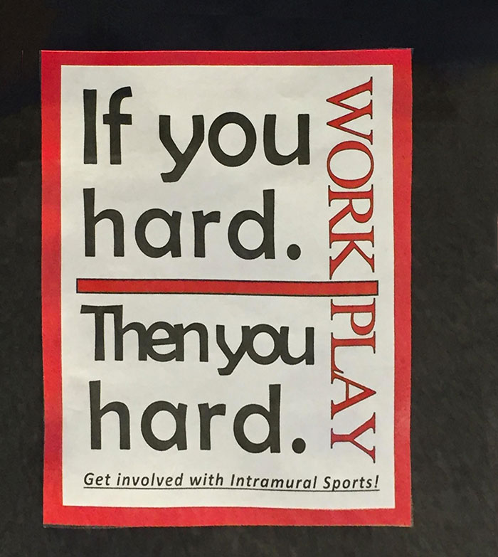
If You Hard, Then You Hard
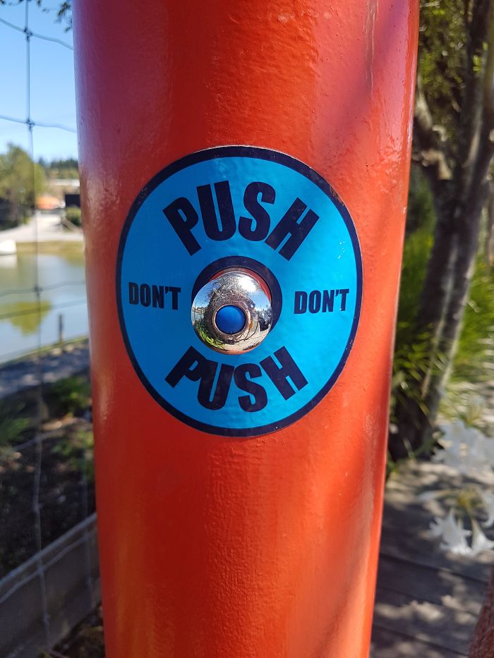
Do I Push?
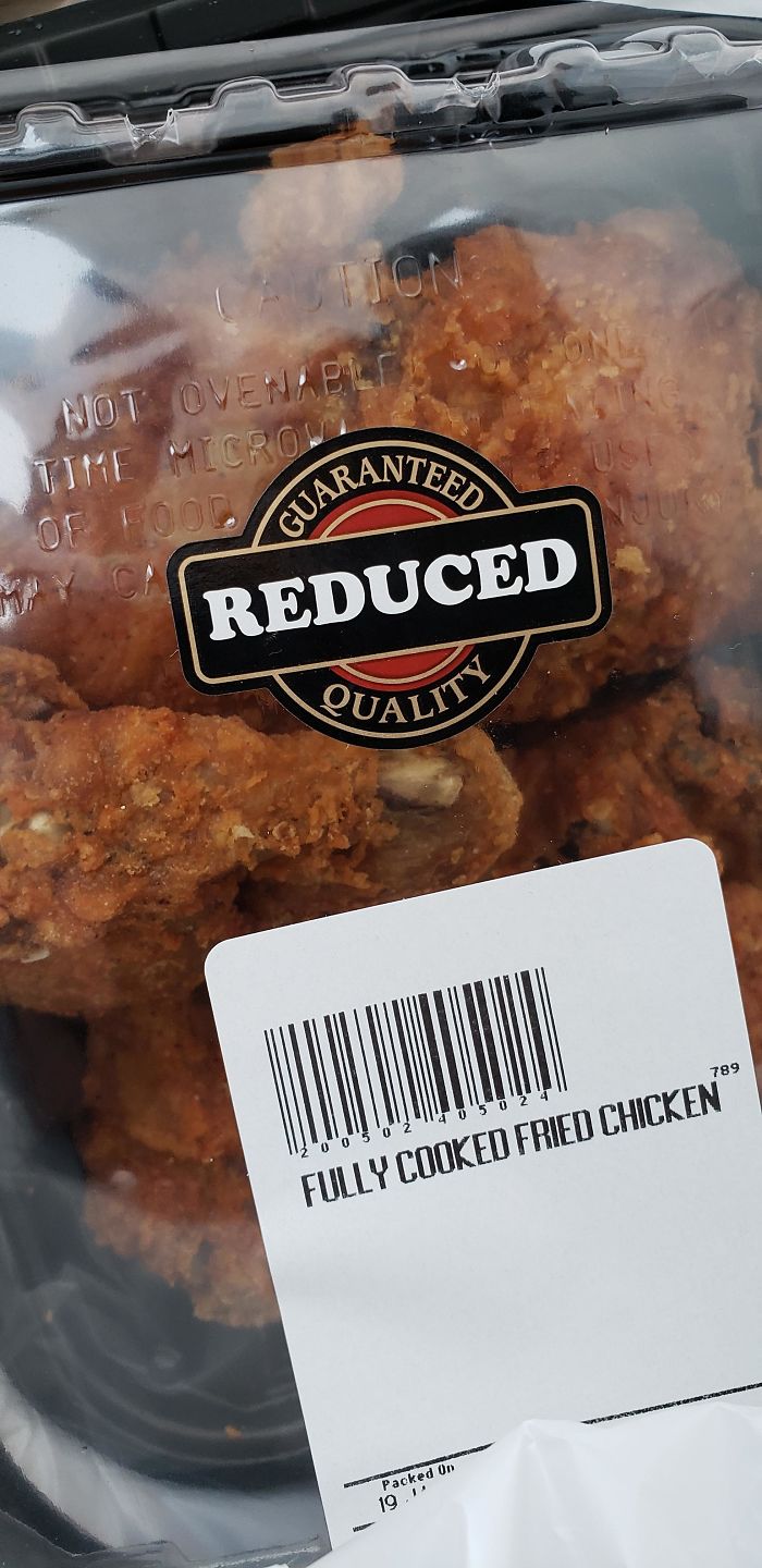
Just Purchased This Low Quality Fried Chicken At The Grocery Store
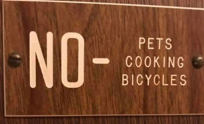
Sorry Guys, You Can’t Let Your Pets Cook Bicycles Here
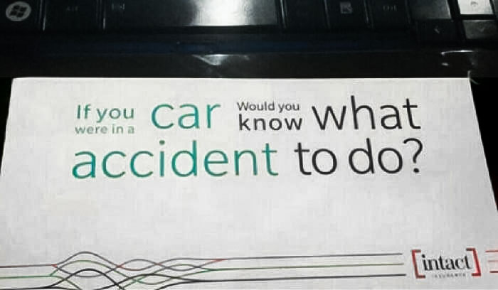
If You Were In A Car, Would You Know What Accident To Do?
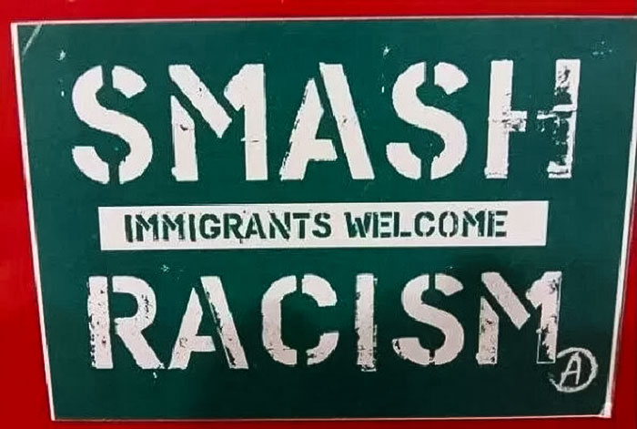
Smash Immigrants Welcome Racism
Honey, I Think We’re Supposed To Turn Right
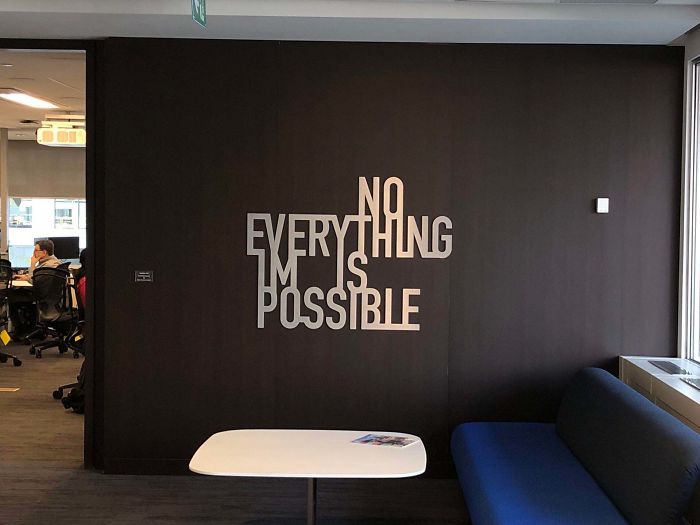
This New Wall Art In My Office
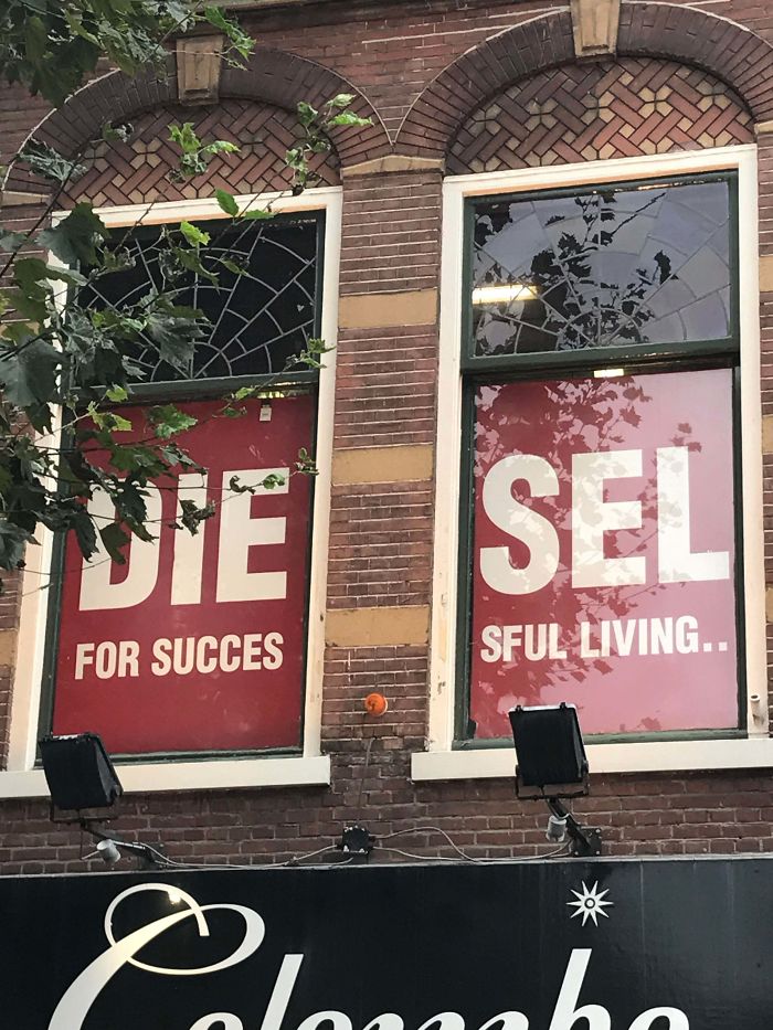
I Only Saw The Left Window At First And Got Very Confused
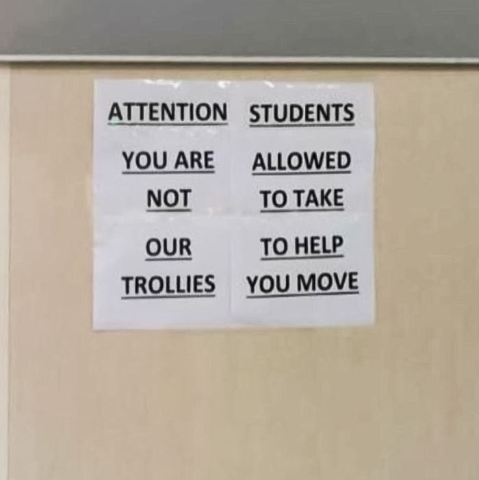
Our To Help Trollies You Move
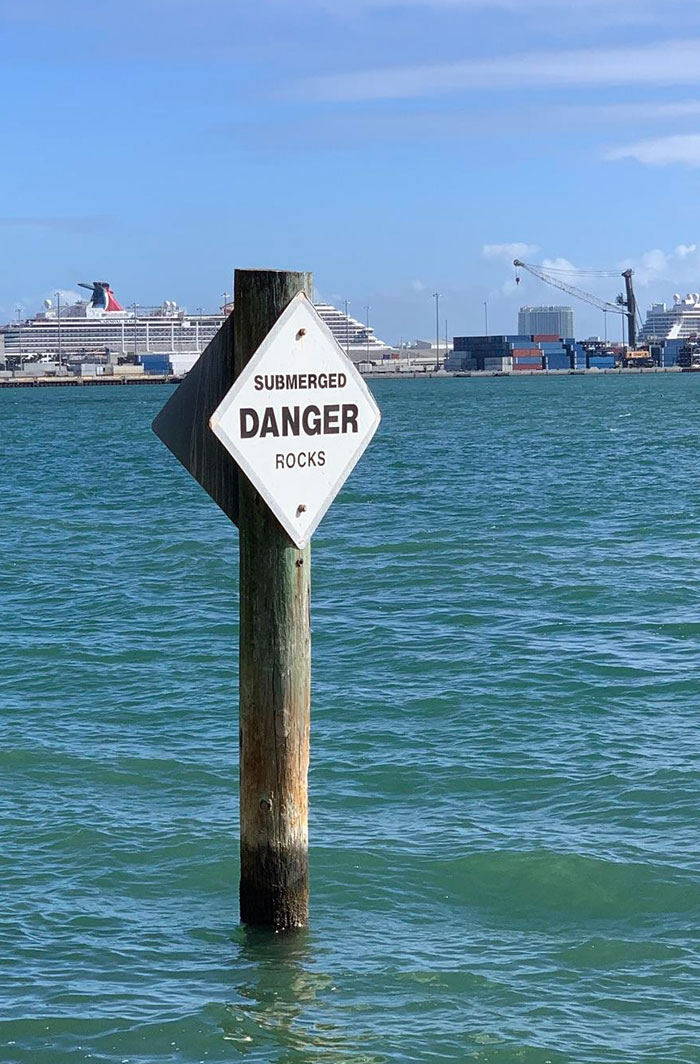
They Are, In Fact, A Particular Sub-Species Of Rock
The Design School I Graduated From Sent This Postcard Out
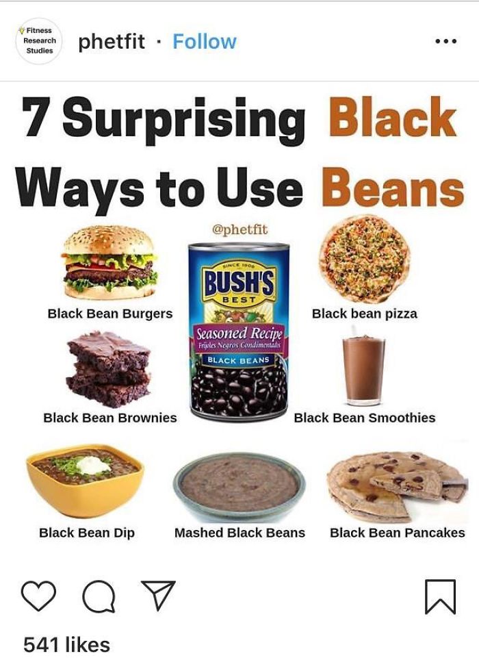
7 Surprising Black Ways To Use Beans
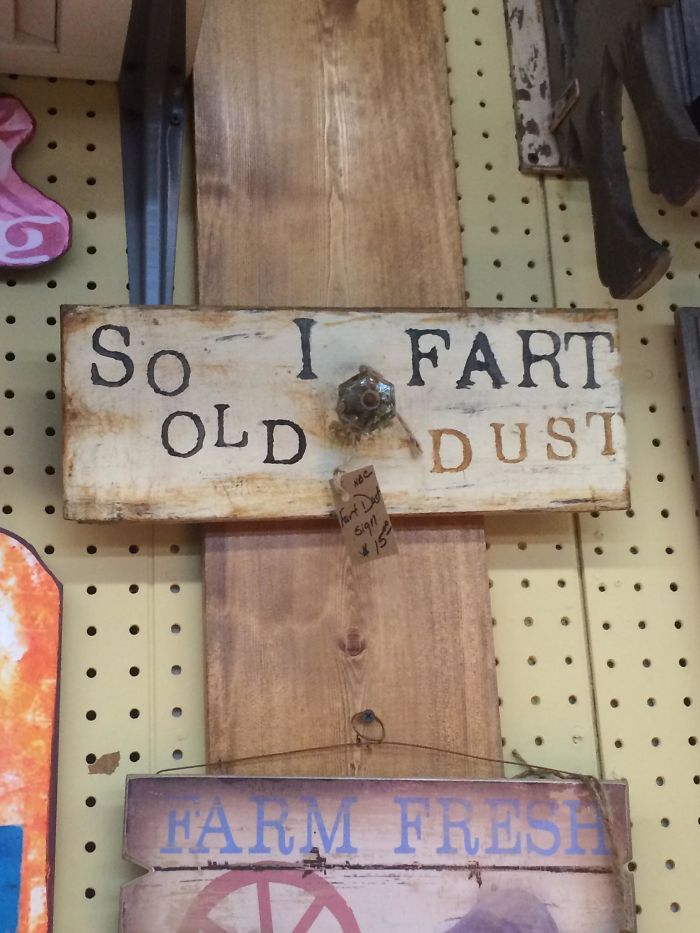
So I Fart Old Dust
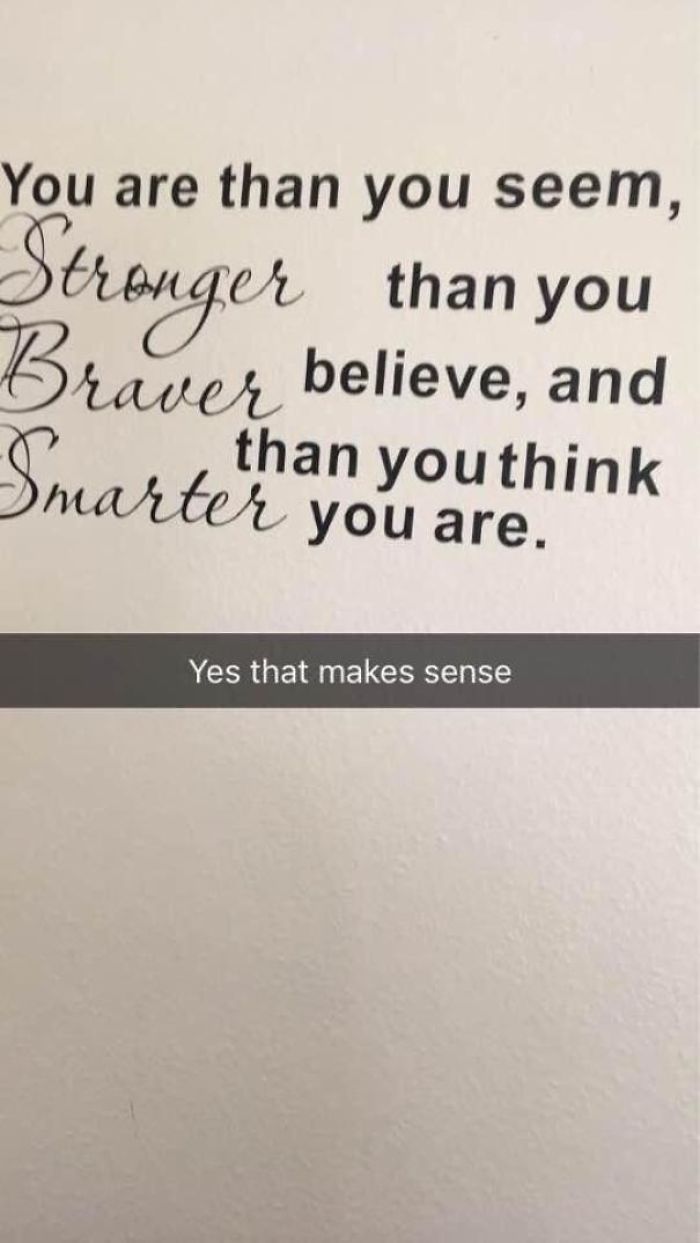
Truly Inspiring
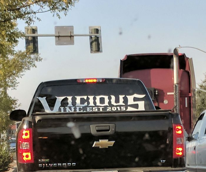
Vicious Inc… What?!
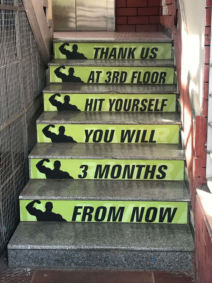
When Your Gym Tryies Hard To Motivate You But Fails To Make Any Sense
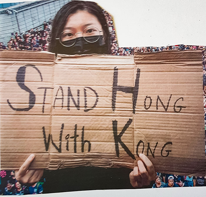
Stand Hong With Kong
This Monstrosity

From Afar, This Sign Has A Completely Different Meaning
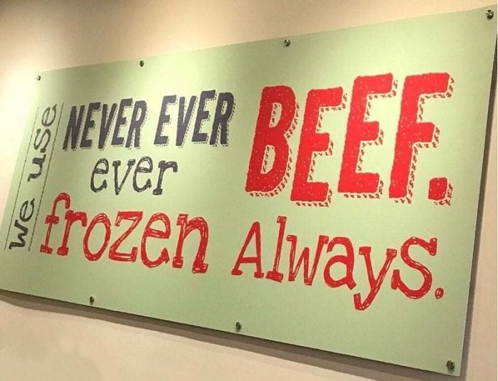
Never Ever Ever Beef. Frozen Always
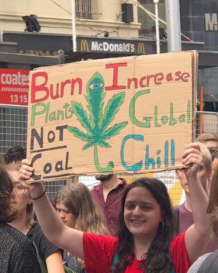
Burn Increase
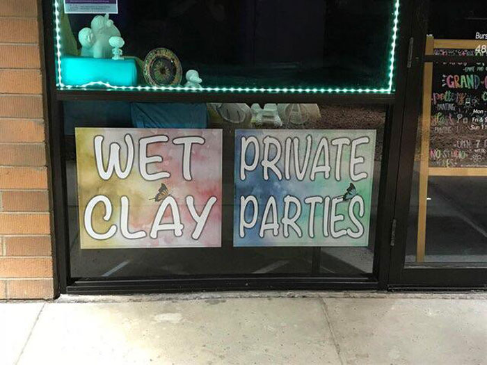
Wet Private Clay Parties
Leave a Comment